There’s something quietly powerful about the arrival of summer. As the desert sun stretches into its full intensity, schools prepare to close for vacation and (hopefully) work slows down just a little, we’re gifted with a rare opportunity: a moment to pause, spend more time at home, declutter, and perhaps reimagine the spaces we live in.
It’s the time of year when our wardrobes shift to lighter hues, and our interiors, too, begin to crave that same sense of freshness and fluidity. Gone are the heavy layers, both in our wardrobes and in our homes. In their place emerges a softer, more intentional narrative, one told through colour, reflecting who we are and how we want to feel.
But where does one begin, especially when the colour spectrum feels endless and the trends ever-shifting? To help decode the season’s most elegant colour directions, we turned to Samah Ahmad, Lead Designer at Bond Habitat. Samah believes that more than just a decorative choice, colour is about expressing emotion, atmosphere and identity. In the world of interior design, it can either make or break a space. While many shy away from colour due to fear of getting it wrong, Samah encourages experimentation. She advises choosing shades that reflect your personality, not just follow trends, and test them in natural light. With the right balance, colour can energise a dining room, soothe a bedroom, boost focus in a home office, or add fun to a child’s playroom. And these need not always require a major commitment - think cushions, artwork, lamps, and other accessories.
With that in mind, here are some of 2025’s most in-demand colours, along with tips for how to incorporate them in a way that feels contemporary, stylish, and aligned with your personality:
Mocha Mousse
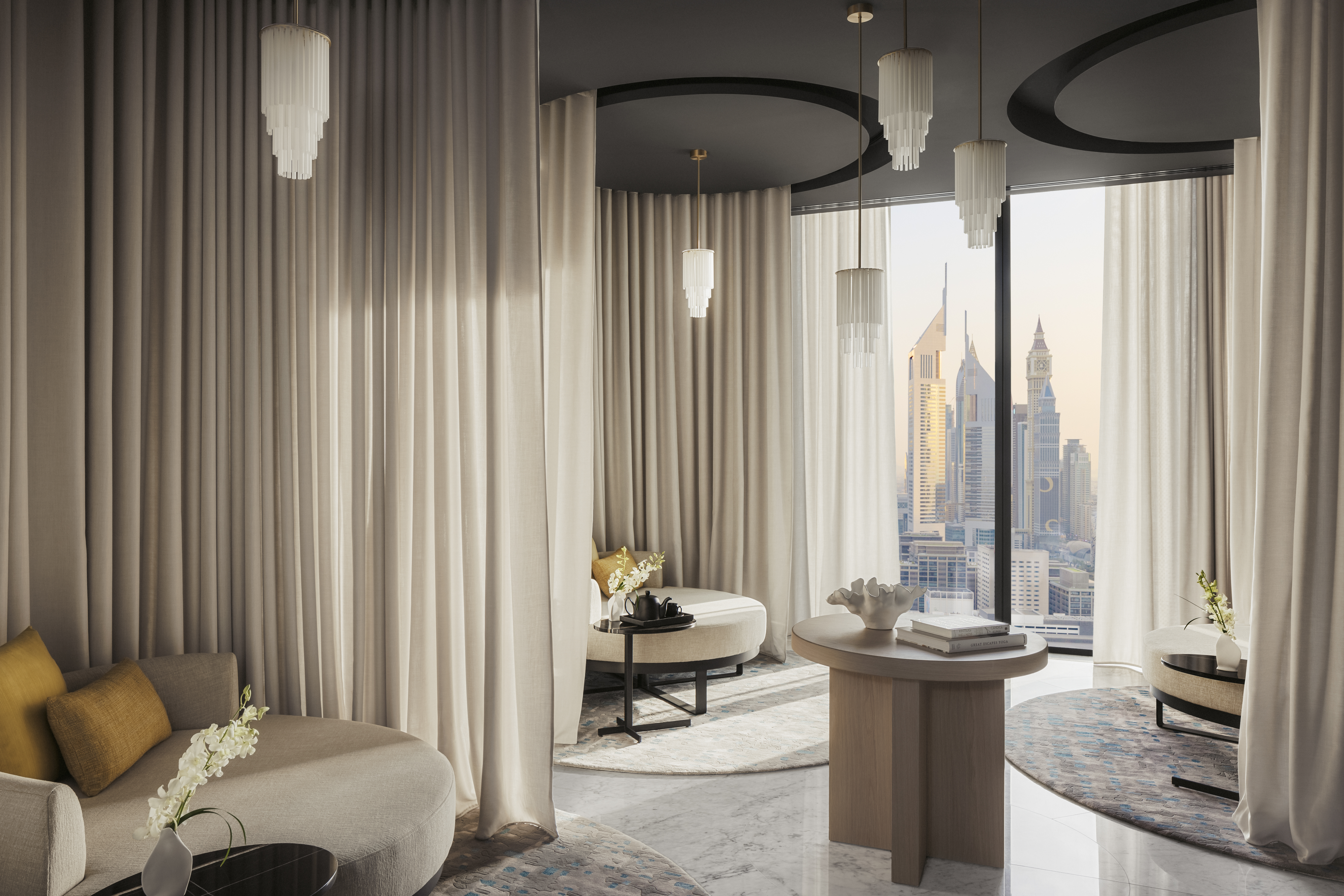
Pantone’s Colour of the Year for 2025, Mocha Mousse, is all about subtlety, warmth, and sophistication. This earthy tone is especially suited to homes in the UAE, where it complements natural materials like marble and enhances the indoor-outdoor flow. Mocha Mousse also taps into the rising "quiet luxury" trend, which favours understated elegance over overt opulence. It works beautifully as a versatile base for walls, floors, or larger furniture, and pairs well with lighter neutrals to create a balanced look. Bonus: it’s timeless and unlikely to put off potential buyers if you're considering resale.
Pale Pistachio
Soft, soothing, and quietly vibrant, pale pistachio offers a fresh, nature-inspired look. It brings a harmonious quality to interiors and pairs wonderfully with organic textures like bamboo, rattan, and indoor plants. Cool and calming, it’s an excellent choice for bedrooms or a chic statement in the kitchen—on cabinets, backsplashes, or feature walls. It's bold enough to make an impression, yet subtle enough to remain versatile.
Purple Basil
This rich, warm purple brings an elegant depth and a sense of introspection. Whether you introduce it through wall art, cushions, or decorative accessories, it adds drama without overwhelming. In heritage-style homes or studies featuring dark wood, Purple Basil can modernise a classic look. If you're hesitant, pair it with neutrals to tone it down, or layer with luxurious fabrics like velvet to enhance its richness.
Butter Yellow
Fresh from the fashion runways, butter yellow is bringing a sunny, uplifting energy to interiors. Soft but striking, this delicate yellow works across a range of rooms. Use it for accent furniture, feature walls, lamps, or rugs to subtly brighten up the space. It’s also ideal for summery tablescapes—paired with green accents and fresh floral arrangements for effortless charm.
When used thoughtfully, even the boldest colours can create wow moments in your home. With endless shade variations to choose from, there’s something to suit every personality and comfort level. At the end of the day, colour is a powerful form of self-expression—so don’t be afraid to experiment, have fun, and make your space uniquely yours.